
In balance and proportion is beauty. This is one of our mantras at Kaleidoscope and one that we apply in each and every one of our projects.
Because the ideal proportion exists, even if it has different names.
When we talk about nature we refer to the golden ratio, the proportions of the human body are perfectly reflected in Leonardo da Vinci’s Vitruvian Man and, when it comes to combining colors, the 60-30-10 rule does not fail.
What is the 60-30-10 rule?
One of the most common problems when decorating a space is the choice of colors and how to combine them with each other so that it is not too flat, but not too eccentric either.
The 60-30-10 rule is one of the most used tricks by interior decorators and that we also apply at Kaleidoscope.
It consists of choosing a dominant color and using it in 60% of the space, a secondary color so that it is present in 30% and a last color for that remaining 10% of space.
Three colors are enough. These percentages create a balanced and attractive decoration.
The dominant colour is the first to catch our attention, while the secondary colour, which corresponds to 30%, gives interest to the room. Finally, the last color is the accent, the final touch that adds shine… like spices or salt in any meal.
Where to use each of the colors?
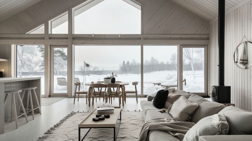
The color chosen as the dominant color that will be present in 60% of the space is, in general, used on walls, ceilings or larger furniture. It is the one that, logically, is most visible at first glance.
If you plan a more traditional and bright decoration, the dominant color is usually neutral (whites, grays…), and then place bright colors in the other percentages.
If you bet on brighter colors, the other percentages will have to have less powerful tones so as not to saturate the eye.
The color that will account for 30% may appear on smaller furniture or textiles such as curtains or rugs.
We recommend that you choose a color that you like and complements the dominant tone.
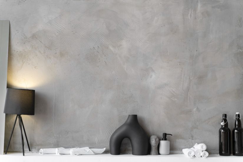
Finally, the third color, which will be present in 10%, is the accent color, the final touch.
In this color you can place cushions, vases, paintings, candles…
Don’t be afraid to choose a bright color as a tertiary color if the other colors in the room are flatter.
Black, for example, is an elegant decorative option. Metallic colors, well combined, will glamorize the environment. In addition, you can play with several shades of that color so that the result is not so flat.
As this color will be in the smallest pieces of the room, you can replace it more easily according to your tastes or the most popular color trends… achieving a very eye-catching change with little effort.
Some examples of percentages to chromatically balance a room:
- Relaxed: Beige (60%), Green (30%), Chocolate (10%).
- Nautical: White (60%), Navy Blue (30%), Red (10%).
- Modern: Grey (60%), Black (30%), Yellow (10%).
- Nordic: White (60%), Grey (30%), Black (10%).
- Serene: White (60%), Beige (30%), Yellow (10%).
If we apply this rule to a space, the result will be proportionate and balanced, however, it must be taken into account that this division of colors does not have to be a totally exact rule either. There is no need to obsess. In the end you are the person who will enjoy that space and you have to be comfortable in it.
The 60-30-10 rule is just one option that can guide you when using different colors.
Note: The image in this post corresponds to an Assemble Studio project. The façade is made of colored concrete tiles.


 Español