
At Kaleidoscope, when we start any of our creative projects, one of the first things we do is look for inspiration, organize our ideas and establish what our starting point will be.
There are several techniques that help us in each creative process; however, one of our favorites is the creation of mood boards. The literal translation of mood board could be something like “trend board”, but the word mood is also closely linked to the idea of “humor” or that mixture of emotions and sensations that awakens inside us when we see something.
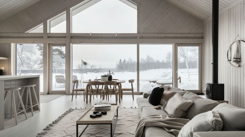
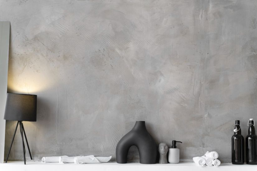
Mood boards they can be digital or physical. They are collages that collect ideas or images around a specific topic. We use them daily in terms of architecture, decoration and interior design.
Sometimes it is difficult to convey ideas with words and mood boards allow us to present concepts in a very simple and visual, creative and intuitive way, managing to generate emotions in those who contemplate it. For this reason, once a month, from Kaleidoscope we will share with you a mood board created around an idea, a concept, a colour… with the aim of being a source of inspiration for your projects and making you aware of the trends in the sector.
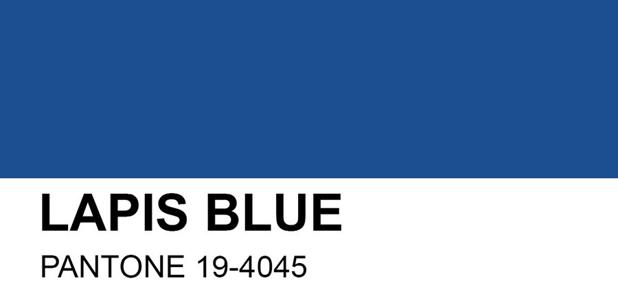
In this case, and coinciding with the summer, we have created for you a board inspired by the Pantone color, Lapis Blue. One of the colors chosen by the brand for this season.
An intense, deep and energetic color. The color of the sea. The color of the Seychelles.
A color that can be combined with Island Paradise and Niagara. The perfect palette to decorate any space and give it a marine touch.
If you’ve been left wanting more and want inspiration for your home, space or office, don’t miss our boards on Pinterest.


 Español